The colors of your favourite books
May 7, 2013 § Leave a comment
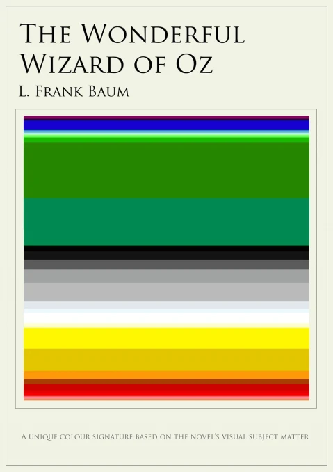
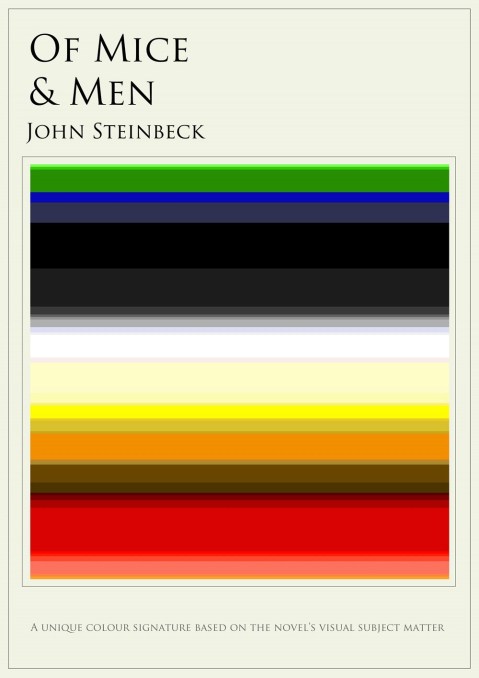
A book: a world full of images, flavors and …colors. Can you really imagine the colors of your favorite novels? Jaz Parkinson has created color charts for different classic works of literature to visually represent the novels’ colorful worlds, building mini rainbows that correspond to the most prominent colors of each work.
via Flavorwire
See also:
How (many pixels) far is it to Mars?
April 6, 2013 § Leave a comment
If the Earth were 100 pixels wide, the Moon would be 3000 pixels away. Mars, at its closest, would be 428,000 pixels away. At the current state of space technology, it will take around 150 days to get to Mars.
Distance to Mars website, created by David Paliwoda & Jesse Williams, calculates the earth’s distance to Mars in a super cool way, in pixels.
Better to watch it on Chrome.
See also:
A poem for April
April 1, 2013 § 1 Comment
I imagine my love
breathing with the lungs of all things
and it reaches me
as poetry
of roses or dustspeaks softly to everything
and whispers its news to the universe
the way the wind and sun do
when they split nature’s breast
or pour the ink of day
on the earth’s book
Adonis from Beginnings of the Body, Ends of the Sea (translated by Khaled Mattawa)
Say it with an illustration
March 28, 2013 § Leave a comment
Say it with a quote or illustrate one? Malaysia-based illustrator Tang Yau Hoong pairs each of his illustrations with a famous quote. As simple as that, as beautiful as these posters…


See more after the jump « Read the rest of this entry »
DNA animated
March 18, 2013 § Leave a comment
DNA explained in a visually appealing way.
Created by Territory Studio and creative director David Sheldon-Hicks & art director William Samuel for BBC Knowledge & Learning Explainer series.
See also:
Minimal science
March 10, 2013 § Leave a comment
When minimalism expresses the essence of meaning, design comes to honor the pioneering work of some of the world’s most famous scientists. From Darwin’s theory of evolution to Pythagoras’ theorem and Archimedes’ principle, Mumbai-based graphic designer Kapil Bhagat creates clever typographic posters of scientists’ names based on each genius’s breakthrough discovery.


See more after the jump « Read the rest of this entry »
Words on their own
February 19, 2013 § Leave a comment
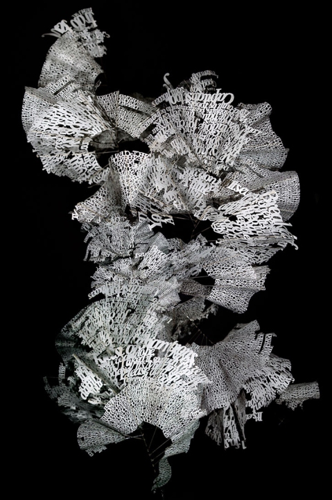
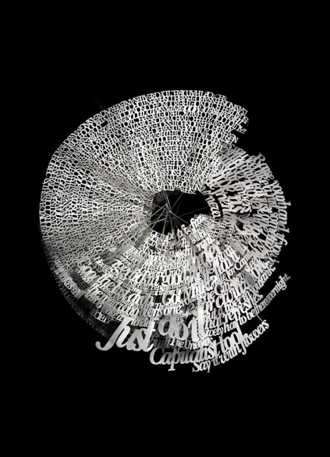
When words and letters acquires a life of their own. Ebon Heath liberates the letters from their frame, the printed page and creates laser-cut sculptures of the letters, giving them a three-dimensional existence with which viewers can actually interact. His typography sculptures, called Stereo.type, become a magical transformation of the written word into what he describes as a “new language of physical type.”
See more after the jump « Read the rest of this entry »
Never stop looking up
February 12, 2013 § Leave a comment
Looking at the windows and not outside a window. This is the concept behind The Windows of New York project. Graphic designer José Guizar has never stopped wandering around New York city and always looking up: at the windows of each building. And then, he decided to start recording and illustrating the city’s facades and windows.

As he says ‘The Windows of New York project is a weekly illustrated fix for an obsession that has increasingly grown in me since chance put me in this town. A product of countless steps of journey through the city streets, this is a collection of windows that somehow have caught my restless eye out from the never-ending buzz of the city. This project is part an ode to architecture and part a self-challenge to never stop looking up’.

In the project’s website, each window appears with the address (street & area), where it is located.

See more windows after the jump « Read the rest of this entry »
Word animals
February 7, 2013 § Leave a comment
Typography once more. This time in the shape of an animal. Graphic designer Dan Fleming uses in his series ‘Word Animals’ the alphabet letters to create the form of the animal represented.


Pretty cool. Don’t you think?

See more after the jump « Read the rest of this entry »
To read a poem
January 13, 2013 § 1 Comment
The state of social media
December 24, 2012 § Leave a comment
The end of yet another year: ideal time for reviews. 2012 was the year where social media have fully established their presence and have become a way of life, according to an infographic by The SEO Company and Nowsourcing.
via Mashable
See also:
Enjoy music
December 9, 2012 § Leave a comment
Even if we do not have to understand music, we surely enjoy it. And we did enjoy this magnificent video animation about the process of learning music by finally., a creative and passionate studio was from Germany.
See also:
And the Oscar goes to …
November 28, 2012 § Leave a comment
We are in the gutter, but some of us are looking at the stars
or
I can resist everything but temptation.
One of the wittiest spirit of literature is also the most quoted. The Guardian gathered Oscar Wilde’s top 50 epigrams in just one infographic:
 via The Guardian
See also:
I will not make any more boring art
October 7, 2012 § Leave a comment
A portrait of the godfather of conceptual art, John Baldessari. A brilliant video for its inspiration, editing, graphic design and, of course, for its narration by Tom Waits.
See also:
Song of the week
October 1, 2012 § Leave a comment
Flavor by Tori Amos (from her new album Gold Dust)
What Does Music Look Like?
September 27, 2012 § 1 Comment
In this blog, I have often wondered if music could be visualised and how it would look like and many artistic experiments I have encountered through the web tried to answer my question.
But I have to admit that no other experiment manages to capture better the look of music than Martin Klimas‘ photographic series, entitled ‘What Does Music Look Like?’. After having covered a speaker with a sheet of translucent plastic, he pours colored paints on that sheet and pumps up the volume. Then he photographs the ‘vibrating’ colors that dance on the air.
Can you recognise the songs? (Hover to find out..)
The beach from above
August 19, 2012 § Leave a comment
Well, I love being on the beach, enjoying the sun, playing with the sand and diving in the cold waters. Photographer Gray Malin seems to enjoy the beach while being on air. How else can I explain his beautifully taken from helicopter photographs of some of the most famous beaches of the world, St. Tropez in France, Copacabana in Brazil and Bondi beach in Australia.
More aerial photos after the jump « Read the rest of this entry »
Data never sleeps
July 30, 2012 § 1 Comment
Data never sleeps? Well yes, if you consider that 206.166.667 mails are sent, 342 blog posts are published, 100.000 tweets are sent, 751 new websites are created every single minute of the day.
Infographic created by Domo
See also:
Lost in the modern metropolis
July 25, 2012 § Leave a comment
We try to hide in our modern metropolis, in the cityscape, but it seems that sometimes the city itself can be also found hidden in our mind and in our thoughts. Beijing-based photographer Jasper James captures in his photographic series called City Silhouettes the expressive silhouettes of different people mingled in the city’s landscape.
See more silhouettes after the jump « Read the rest of this entry »


