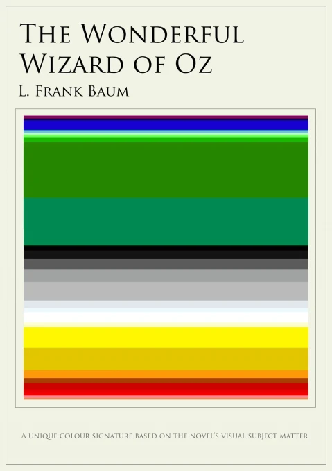
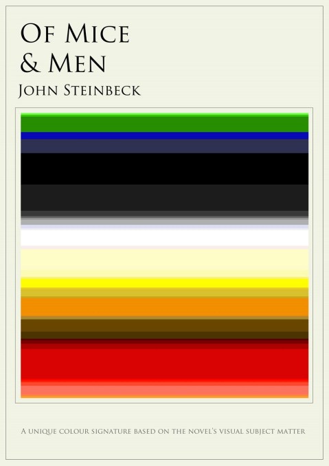
The colors of your favourite books
May 7, 2013 § Leave a comment
A book: a world full of images, flavors and …colors. Can you really imagine the colors of your favorite novels? Jaz Parkinson has created color charts for different classic works of literature to visually represent the novels’ colorful worlds, building mini rainbows that correspond to the most prominent colors of each work.
via Flavorwire
See also:
Say it with an illustration
March 28, 2013 § Leave a comment
Say it with a quote or illustrate one? Malaysia-based illustrator Tang Yau Hoong pairs each of his illustrations with a famous quote. As simple as that, as beautiful as these posters…


See more after the jump « Read the rest of this entry »
Minimal science
March 10, 2013 § Leave a comment
When minimalism expresses the essence of meaning, design comes to honor the pioneering work of some of the world’s most famous scientists. From Darwin’s theory of evolution to Pythagoras’ theorem and Archimedes’ principle, Mumbai-based graphic designer Kapil Bhagat creates clever typographic posters of scientists’ names based on each genius’s breakthrough discovery.


See more after the jump « Read the rest of this entry »
Never stop looking up
February 12, 2013 § Leave a comment
Looking at the windows and not outside a window. This is the concept behind The Windows of New York project. Graphic designer José Guizar has never stopped wandering around New York city and always looking up: at the windows of each building. And then, he decided to start recording and illustrating the city’s facades and windows.

As he says ‘The Windows of New York project is a weekly illustrated fix for an obsession that has increasingly grown in me since chance put me in this town. A product of countless steps of journey through the city streets, this is a collection of windows that somehow have caught my restless eye out from the never-ending buzz of the city. This project is part an ode to architecture and part a self-challenge to never stop looking up’.

In the project’s website, each window appears with the address (street & area), where it is located.

See more windows after the jump « Read the rest of this entry »
The hardly spoken words
July 10, 2012 § Leave a comment
The difficult words, the unusual words: all these words that are rarely spoken and whose meaning we cannot even imagine. Designers James and Michael Fizgarald, the illustration duo from Ireland, also known as The Project Twins, have ‘gathered’ all these words that are rarely spoken and managed to visually explain them.
Acersecomic: a person whose hair has never been cut.
Zugzwang: a position in which any decision or move will result in problems.
Do you know any of them? See more peculiar words after the jump. « Read the rest of this entry »
Where is my pictogram?
March 26, 2012 § 2 Comments
We have already seen movie posters made by pictograms, now it’s time to see some of our favourite songs depicted by nothing but ideograms. Viktor Hertz proves us one more time that less is often enough to convey meaning.
See more after the jump « Read the rest of this entry »
Finnegan woke up and got illustrated
March 16, 2012 § Leave a comment
To read James Joyce’s Finnegans Wake, is quite an experience; I cannot even imagine how could anybody try to illustrate its world of dreams and illusion.
In February of 2010, Paris-based designer and illustrator Stephen Crowe decided to undertake this task; to illustrate chapter by chapter one of the most difficult works of fiction in the English language. The result is an ongoing project entitled Wake in Progress, in which different techniques and design styles are mixed together.
See more after the jump « Read the rest of this entry »
What happened on the internet in 2011?
January 24, 2012 § 1 Comment
We know what happened last year on the internet, but this year? The London design agency Syzygy weaves together “20 greatest, funniest and most insane internet events from 2011.”
Can you recognise them?
See also:
Last quiz of the year
December 30, 2011 § 2 Comments
Last quiz of the year: Back to the eighties to test our knowledge and memory. Designer Stephen Wildish created the 1980′s Film Alphabet, a great graphic that challenges our pop culture movie knowledge from the eighties.
Each letter and a movie. Can you recognise them?
See also:
The history of Western typefaces
December 9, 2011 § Leave a comment
You know it already. itsasmallweb loves words and their design, we are obsessed with fonts and typefaces and that is why we got really excited with Mashable’s infographic: A History of Western Typefaces. Here is their story:
See the full infographic after the jump
This is definitely a horror film
November 16, 2011 § 2 Comments
Well, it seems that each film genre has a design style of its own, or, to put it correctly, each film genre has the same design style. French film distributor Christophe Courtois gathered thousands of film posters and assembled them together just to point out that indie film posters are always yellow; there is always a (third) eye in horror films; all women wear red dresses in romantic comedies; people appear blindfolded in law and justice films -perhaps because justice is always blind?- and all nature documentary posters are blue.
See more after the jump « Read the rest of this entry »
A life in film and design
November 15, 2011 § Leave a comment
In just a title, you have to capture the essence and give identity to a brand, a cover, a film. That’s why we can comprehend some of designers’ ‘peculiarities’ and that is the reason we love Saul Bass and his work: he managed to convey through graphic design the atmosphere of some of the greatest films of Alfred Hitchcock, Otto Preminger, Stanley Kubrick and Martin Scorsese.
His work is put together in a book, entitled Saul Bass: A Life in Film & Design, designed by his daughter Jennifer Bass and written by distinguished design historian Pat Kirkham. The large tome covers more than 1,400 illustrations, covering classic films such as Anatomy of a Murder and Vertigo and many others never published before. To celebrate the release of the book, Ian Albinson created the following video, which highlights some of Bass’ most celebrated films.
via Visual News
See also:
Follow @itsasmallwebShape type: the letter shaping game
October 31, 2011 § 1 Comment
To shape the font, to form the misshaped character: this is the goal of Shape Type, an interactive typographic letter-shaping game, created by interactive designer, Mark MacKay.
Shape Type, made using HTML5, is a 10-stage game that asks from its users to form and fix the badly shaped, unfinished letters from specific typefaces, given the font names and fonts’ designers.
When the users have adjusted multiple bezier handles to get the shape of the character right., they can visually compare their effort with the original character and their score is a percentage based on the similarities.

via Design Taxi
See also:
Follow @itsasmallwebWord as image
October 12, 2011 § Leave a comment
The great challenge: to ‘create an image out of a word, using only the letters in the word itself and their graphic elements without adding outside elements’. That was what Ji Lee, former Creative Director at Google Creative Labs (we first met him here), did in his new book Word as Image. Have a first look of his work in this wonderfully animated video:
You can find his book here.
via Quipsologies
See also:
Minimal landmarks
August 24, 2011 § Leave a comment
How can we disguise some of the city’s most famous buildings and still recognise them? Through an minimalistic approach, graphic studio Design By House managed to reveal famous landmarks under multiple layers of colors and different shapes.
See more after the jump « Read the rest of this entry »
All must be shared to win the war
July 31, 2011 § Leave a comment
Twitter has followers, Facebook has causes and Google+ is the new cult. 
Propaganda posters by Aaron Wood. « Read the rest of this entry »
Minimal tales
July 27, 2011 § 1 Comment
Fairy tales and children stories usually create a whole new world full of images to give life to the eloquence and vivid imagination of the author, but these minimalistic posters created by Christian Jackson manage to convey equally each fairy tale’s essence, highlighting just one image like Rapunzel’s golden braid or Snow White’s poison apple.
See more after the jump « Read the rest of this entry »
The first ever designed album cover
July 20, 2011 § 4 Comments
We love music, we love design and we just love the work of Alex Steinweiss, art director and graphic designer who died at the age of 94. He invented in 1938 the idea of a custom artwork to record album covers and designed the first covers with original design, replacing the existing non branded 78 rpm record inside protective, pasteboard covers which included only the name of the album and artist simply stamped on the cover and spine.
See more covers after the jump « Read the rest of this entry »


